
This post is part of a series of articles about writing my novel, A Single Source of Truth.
Don’t judge a book by it’s cover!
And yet, everyone does it. We can’t help it, it’s in our nature, which is why it’s super important to have a stand-out, memorable and professional-looking book cover. If those elements are missing, it doesn’t matter how good the actual book is… very few are actually going to read it. It’s a sad truth, but luckily, it’s very simple to get yourself a professionally designed book cover these days thanks to freelancer websites such as Fiverr, PeoplePerHour, 99Designs etc. These websites work just like Reedsy. You log on, create a job, add your brief (what you’re looking for), and then people contact you with a bid to get the job.
The ideal book cover might just be one that you, the author, really likes. But there’s also a clever technique to finding an alluring book cover.
A/B Split Testing
The concept behind A/B split testing is to get at least two different designs for the book cover, prior to publication. Using an online advertising platform such as Google or Facebook, you create ad campaigns, one containing the first cover, and the second one the other (in fact, many big platforms have an A/B split testing feature already built-in). Each ad should be identical in terms of information, it’s just the cover that is different.
This can be done even before your book is written, let alone published because it’s not important to have a genuine landing page ready for the clicking user, you simply send them to some random page, like the BBC website if you wanted. The statistics on which ad was clicked, how many times and when are all captured in the advertising platform. The goal with A/B split testing is to pit two different covers against one another. If you had 4 covers designed, you can vary it and build some sort of a league between them.
Taking into account the ‘reach’ of the ad (the number of people it was shown to), the one with the most clicks at the end of X days/weeks is the winner.
My Own Design
I’d like to say that I used a freelancer to design my book cover and that I used A/B testing to find out the best performer. But I didn’t. See, I’m a bit of an amateur Photoshopper and have designed a number of flyers, posters and covers over the years. I actually really like designing posters, and so when it came to getting a cover for my own book, I could have gone the professional route – delegating the work to someone more skilled for a fair price – or I could have done tackled the problem myself. I did the latter.
I’m probably going to butcher this next section where I want to discuss the concepts of image design, because honestly, despite being quite structured in my methodical approach to writing, when it comes to images I normally just jump in headfirst without any foundation work. In fact, I typically don’t even know what I want or how it will look at first, I just try stuff out, throwing things at a digital wall and seeing what sticks. Almost all of it will be crap.
I’d first started work on a book cover for back in 2012 when it was still titled ‘DATABASE’, just around the time I was finishing up the first draft. Little did I know it’d be another 7 years before it’d hit the “shelves”. Personally, I think it’s helpful to get an idea for a cover in your head early on. It allows you to really visualise the novel, sat on a bookcase, or as an image listed on Amazon. It makes the thing more concrete.
Here, click through the slideshow below to get a peek at some very early concepts of the book cover.

My first design, experimenting with the database ‘cells’ or pixel imagery. 
This was where I had the idea for some sort of foriegn entity… a red pixel. Something that’s just not quite right. An error in the system. 
Experimenting a bit more with the title. 
This was to test the cover of a book that was just scrawling in text. I wanted to have the idea that no digital information is safe, and I was genuinely going to print all my personal details on the front cover to emphasise that. Glad I didn’t! 
I got a photo of myself and pixelated it. I think the style was a bit of a rip off the poster for the film Michael Clayton, but it worked quite well. I realised though that when it was shrunken down to the size of an Amazon book on their site, it just looked like a picture of me. 
A different style with the cells, but this was the first time I used to the new title of the book. 
I think I grew to love the blue and red colour scheme, a style that made it into the final cover.
Horrible, right? Okay, I didn’t spend much time on these… I just wanted to have a play with some concepts I had in my head, the main one being the idea of a database. If anyone has ever worked with spreadsheets, you’ll know what I mean when I say database, because a spreadsheet is essentially one. Lots and lots of cells of data. One of the main themes behind the novel is the fact that more information about our lives and the world are being digitised, held in databases; and the data can be manipulated. I wanted to evoke that idea in the novel, so at first, I had a go at creating a kind of ‘grid’ look and feel to it. I also had an idea about pixels, the building blocks of any digital image (including this article you’re reading). Pixels are much like the cells of a database, or ‘bits’… 1s and 0s. It’s either there, or it’s not. It’s either true, or it’s false.
Once this idea of database cells entered my head, many years before I’d even finished the book, I couldn’t shift it. It’s probably the reason why I decided to design the cover myself with no input from anyone else, nor any marketing strategy. It’s the reason many things in this book happened the way it did… stubborn ideas!
Elements to the Classic Cover
The cover of a novel normally consists of three parts. The name of the author, the title of the book, and a short and punchy tag line or phrase that entices the reader. They can also have a quote from a review on the front, usually if a big name like Lee Child has been given a preview copy of the book. Unfortunately, Lee was too late submitting his glowing review of mine for me to include it *cough*.
The author name and book title are generally the easy parts, as long as you’re not deliberating over a pen-name or the book title. I had toyed with the idea of a pen-name, but I figured that I didn’t want to lead a double life, I just want to be entirely myself, and so all my work will come under the same person. The book title I’d had for a few years . The tag line required a bit more creativity.
Tag Lines
Taglines are important to grab the reader. There’s also not a lot of space for them, so they have to be concise. Here is a list of all the ones I came up with:
- Data is King. If You Believe it.
- Data is King. Data Can be Altered.
- Data is Power.
- Your Data Can be Altered
- Data Can be Altered.
- The Data Does Not Lie
- Don’t Believe Everything You See/Hear/Read
- Don’t Believe Everything
- Do Not Trust The Data
- Don’t Believe Anything
- The Digital Domain Can Be Altered
- Your Data or Your Life
- Who Can Tell What’s Real or Not?
- The Data Never (Sometimes) Lies
- Data Does Not Lie – The Winner!
- The Data Doesn’t Lie
Finding the Final Cover
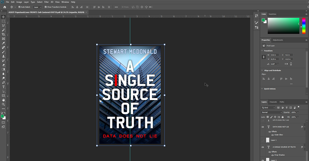
As you can see from the test images above, I went through a few designs, but I’d already had my mind set on a kind of cell/pixel style look, washed in a blue hue, with a single red element… an errant object, something that became even more relevant when the book title changed to A Single Source of Truth. The red element would signify the ‘single source of truth’. It wasn’t until the beginning of 2019 when I started to realise the book was going to be actually self-published, and so I would definitely need a cover.
I couldn’t quite tell you when I thought of the idea of a building, but once it got into my head it wouldn’t leave. A tall building, with lots of windows. The windows would be the cells of the database, and the building would be faceless… mysterious, the reader will have no idea what goes on behind its closed doors. There were a few metaphors in the image that I quite liked, and I didn’t even compare it to the Studio (an organisation that appears in the novel) until much later. It was more the concept of an anonymous building that I liked. And I needed a good photo of a building.
It had only been a few days prior that a friend of mine, Chris Chapman, had been taking photos of buildings in and around Leeds where he lived and posted them on Facebook. I contacted him and told him about the book and he was up for taking some shots. Within a few days, he came back with a raft of images. Suffice to say, one of them stood out.
It took a couple of weeks to get the first template of the cover created, then probably another month of tweaking to get it to where I wanted it. It still went down to the wire, and probably a week prior to the book being published in June of 2019, I was still messing with it, widening the font, or tweaking the tag line. It was just like writing… try something, look at it, sleep on it and come back with fresh eyes.
One thing that helped was to mock-up what it would look like on Amazon alongside all other books on there.

Comparing my book side by side with others allowed me to spot design issues. For example, in the image above, it wasn’t until I saw it on Amazon that I realised the title font didn’t have enough weight to it. There were a few more corrections like that, until I was eventually happy with the final design.

For my next book, I think I’m going to hire someone to design the cover. Not only will it save me a lot of time, but it’s always a great learning experience to share creative ideas with another person.
Stay tuned next week for when I’ll go through the finishing touches to get the book ready for Amazon.
If you have any comments or questions, please post them in the box below.
Leave a Reply